
1. はじめに
ggpmiscは、フィットされたデータや要約データのアノテーションや強調に特化したggplotの拡張機能です。データの要約をテーブルで表示したり、ピーク値を文字で表示したりできます。
2. インストール
CRANからインストールできます。
install.packages("ggpmisc")3. つかってみる
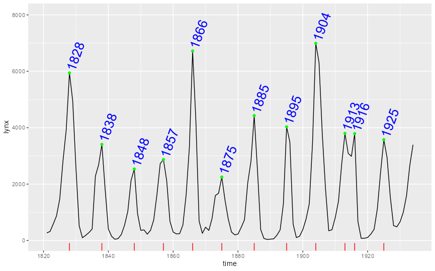
時系列データでピークに点を打ったり、その値を表示したりできます。
library(ggpmisc)
library(ggrepel)
library(broom)

ggplot(lynx, as.numeric = FALSE) +
  geom_line() +
  stat_peaks(colour = "green") +
  stat_peaks(geom = "text", colour = "blue", size = 7, angle = 70, hjust = -0.1, x.label.fmt = "%Y") +
  stat_peaks(geom = "rug", colour = "red", sides = "b") +
  expand_limits(y = 8000)
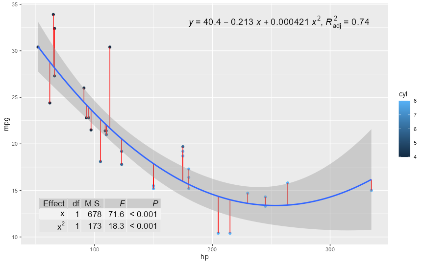
フィットさせた関数を表示したり、結果の要約テーブルを表示したりできます。数式は、stat_poly_eq()関数で、テーブルはstat_fit_tb()関数で制御できます。
formula <- y ~ x + I(x^2)
ggplot(mtcars, aes(hp, mpg, col=cyl)) +
  geom_point() +
  stat_fit_deviations(method = "lm", formula = formula, colour = "red") +
  geom_smooth(method = "lm", formula = formula) +
  stat_poly_eq(aes(label =  paste(stat(eq.label), stat(adj.rr.label), sep = "*\", \"*")),
               size=5, formula = formula, parse = TRUE, label.x.npc = "right")+
  stat_fit_tb(method = "lm",
              method.args = list(formula = formula),
              tb.type = "fit.anova",
              tb.vars = c(Effect = "term",
                          "df",
                          "M.S." = "meansq",
                          "italic(F)" = "statistic",
                          "italic(P)" = "p.value"),
              tb.params = c(x = 1, "x^2" = 2),
              label.y.npc = "bottom", label.x.npc = "left",
              size = 4.5,
              parse = TRUE)
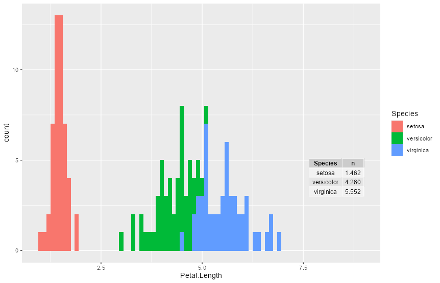
グラフに表を加えることもできます。
library(tidyverse)
library(ggpmisc)

tbl <- iris %>%
  group_by(Species) %>%
  summarize(n=mean(Petal.Length))

ggplot(iris, aes(x=Petal.Length, fill=Species)) +
  geom_bar() +                                               # Add table to ggplot2 plot
  annotate(geom = "table",
           x = 9,
           y = 3,
           label = list(tbl))
4. さいごに
ggplotの使いやすさと機能がさらに向上します。【R】ggpmisc